Nuvera
Skincare e-commerce landing page
Background
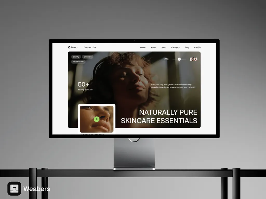
Nuvera sells naturally pure skincare essentials. The brand wanted a storefront that feels premium and calm: warm, sunlit photography, generous white space, and a product story that reads in seconds rather than paragraphs.
Challenge
Skincare shoppers compare constantly, so the page had to present products clearly and keep the browsing path short. That meant a strong visual hierarchy, category pills that filter without leaving the page, product cards with price and stock at a glance, and a minimal UI that never competes with the imagery.
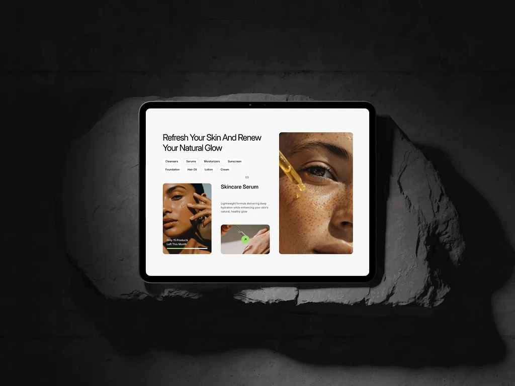
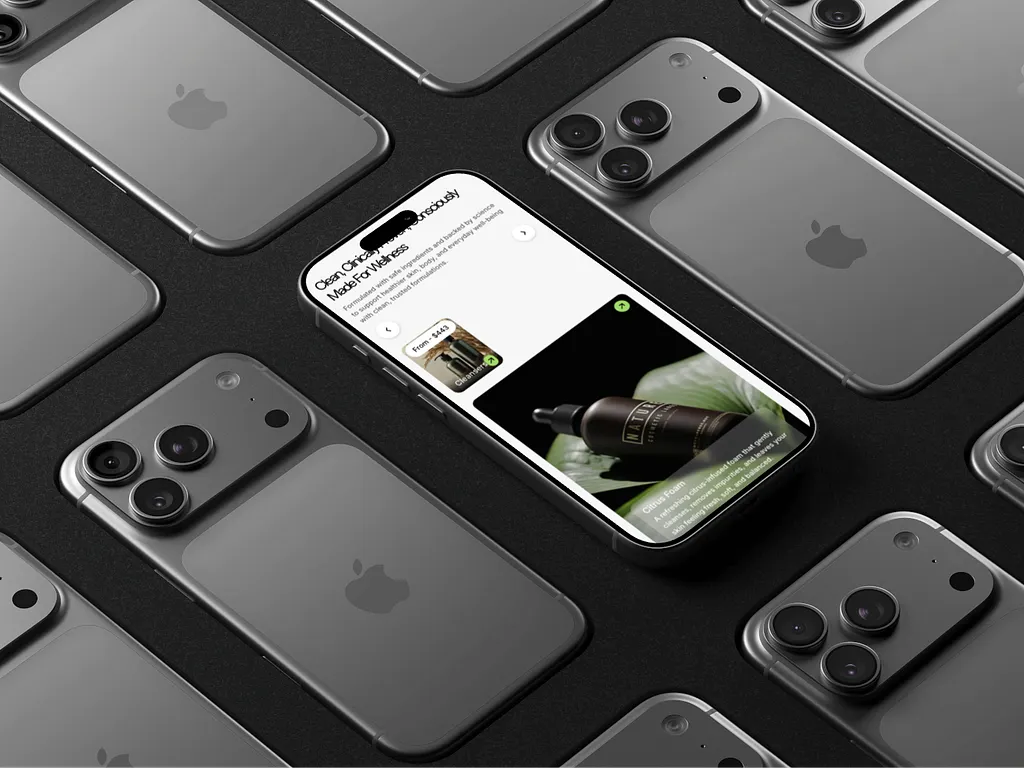
The redesign pairs an editorial hero with a compact, shoppable product grid and a single lime-green accent that marks every action. Designed for every screen size, from a wide desktop layout to a tablet grid and a one-column phone flow, it makes the brand feel premium while keeping the experience intuitive.
3
Screen sizes designed
Live
Webflow Marketplace