Design Systems for SaaS Startups
You don't need a 200-page Figma library. Here's the minimal design system that actually ships fast and scales with your product.
Author:
Weabers Team

You don't need 200 components before you've found product-market fit.
Design systems are genuinely valuable. Consistent UI, faster development, cleaner handoffs — the benefits are real. But the design systems most SaaS startups build are engineering problems disguised as design problems. They're too big, too rigid, and too expensive to maintain at the stage where speed matters most.
Here's what a minimal design system actually looks like — one that ships fast, scales with your product, and doesn't require a dedicated platform team to maintain.
Start with decisions, not components
Most teams start a design system by building components: buttons, inputs, cards, modals. This is backwards. Components are implementations of decisions. If you haven't made the decisions first, you'll build the wrong components — and rebuild them when the decisions change.
The decisions that matter first:
Color. One primary, one accent, a neutral scale, semantic colors for success/warning/error. That's it. Don't design a palette of 200 shades before you've shipped a single screen.
Typography. One typeface family. Three weights. Four sizes for body copy, three for headings. A line-height scale. Document this and stop making font decisions per screen.
Spacing. Pick a base unit — 4px or 8px — and use multiples. Consistent spacing is what separates "polished" from "almost right."
Border radius. One value for small elements, one for cards, one for full pills. Three values. Make them consistent and never deviate.
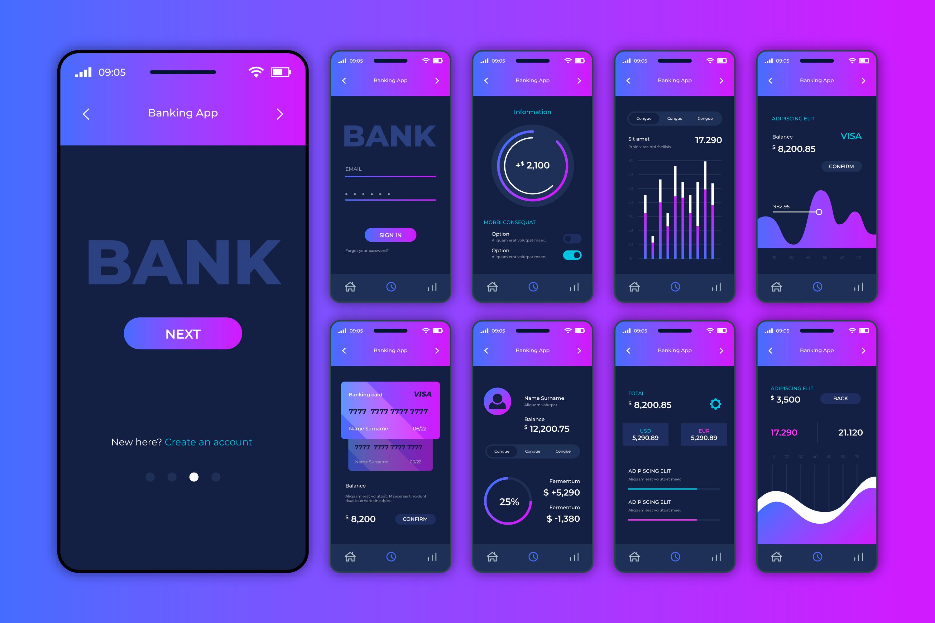
The five components that actually matter early
Once your decisions are documented, build these five components and only these five:
Button. Primary, secondary, destructive. With icon variants. This is the most used component in any interface — get it right and get it done.
Input + Form field. Text input, select, checkbox, radio. Label, hint, error states. Every form in your product uses these.
Card. A container with consistent padding, border, and optional header. More flexible than it sounds.
Badge / Tag. Status indicators, category labels. Small but used everywhere.
Navigation. Sidebar or top nav, whichever your product uses. This sets the skeleton for every screen.
Build these five components with all their states — default, hover, focus, disabled, loading, error — and you have enough to build almost anything.
Documentation is the system
A design system that lives only in Figma is not a design system — it's a design file. The system is the shared understanding between designers and developers about how things should look and behave.
You don't need a Storybook instance or a dedicated documentation site. A single Notion page with screenshots, usage guidelines, and a list of do's and don'ts is enough to get 80% of the value.
What matters: when a developer is implementing a new screen, do they know where to look? When a designer is adding a new component, do they know what already exists? If yes, you have a design system. If no, you have components — which is a different, smaller thing.
When to invest more
A minimal system is right for 0 to 50 engineers. Once you cross that threshold, the investment in a more formal system starts to pay off. You'll know it's time when: component inconsistency is causing real bugs, onboarding new designers takes too long, or the same components are being rebuilt in multiple places.
Until then: make the decisions, build the five components, document them plainly, and spend the rest of your time shipping product.