Fintech UX: What Banks Get Wrong
Fintech products are complex by nature. But complexity is never an excuse for a confusing experience. Here's how we approach fintech UX.
Author:
Weabers Team
Complexity is not a feature. It's a failure of design.
Fintech products deal with genuinely complex subject matter — money, risk, compliance, multi-party transactions. The instinct is to reflect that complexity in the interface: show everything, explain every edge case, surface every option.
This instinct is wrong. Complexity in the domain is a reason to invest more in simplicity in the interface — not less.
The trust paradox in fintech UX
Fintech designers face a genuine tension: users need to trust the product enough to give it access to their money, but they also need to understand it well enough to feel safe. These two requirements pull in opposite directions.
Showing everything signals transparency — but overwhelming interfaces signal incompetence. A dashboard with 40 data points on the first screen tells the user "we didn't make any decisions about what matters." That's not reassuring. That's anxiety-inducing.
The resolution to this tension is progressive disclosure. Show what matters first. Make everything else accessible but not visible by default. The user who needs the advanced view can find it. The user who just needs to know their balance can see it immediately.
What banks consistently get wrong
Navigation designed for the org chart, not the user. Bank interfaces are famously organized around internal departments — "Accounts," "Cards," "Loans," "Investments" — because that's how the bank is organized internally. Users don't think in these categories. They think in tasks: "pay a bill," "send money," "check what I spent." Navigation should reflect user mental models, not internal structure.
Error messages written by lawyers. "Transaction declined due to insufficient available funds relative to posted balance" is technically accurate and completely useless. "You don't have enough money for this — your balance is $47.23" is what the user needs. Error messages in fintech should be human, specific, and actionable.
Friction in the wrong places. Security friction — two-factor authentication, confirmation dialogs for large transfers — is appropriate and expected. But the same friction applied to every action trains users to ignore warnings. Reserve high-friction moments for genuinely high-risk actions. Make everything else fast.
Onboarding that feels like a compliance checklist. KYC and identity verification are legal requirements in fintech. But the experience of completing them doesn't have to feel like filing taxes. Progress indicators, plain language explanations of why each piece of information is needed, and a clear sense of how long it will take — these are small changes that dramatically reduce drop-off.
What the best fintech products do instead
The fintech products that win on UX have made a deliberate choice: they've decided what their product is for and ruthlessly cut everything else.
Revolut's core experience is fast, frictionless money movement. Everything in the interface serves that. Stripe's dashboard is optimized for developers who need to understand transaction data quickly. Every design decision flows from that clarity of purpose.
The mistake most fintech products make is trying to be everything — every feature, every use case, every user type — without making the hard decisions about hierarchy and priority. The result is an interface that works for nobody particularly well.
The UX principles we apply to fintech work
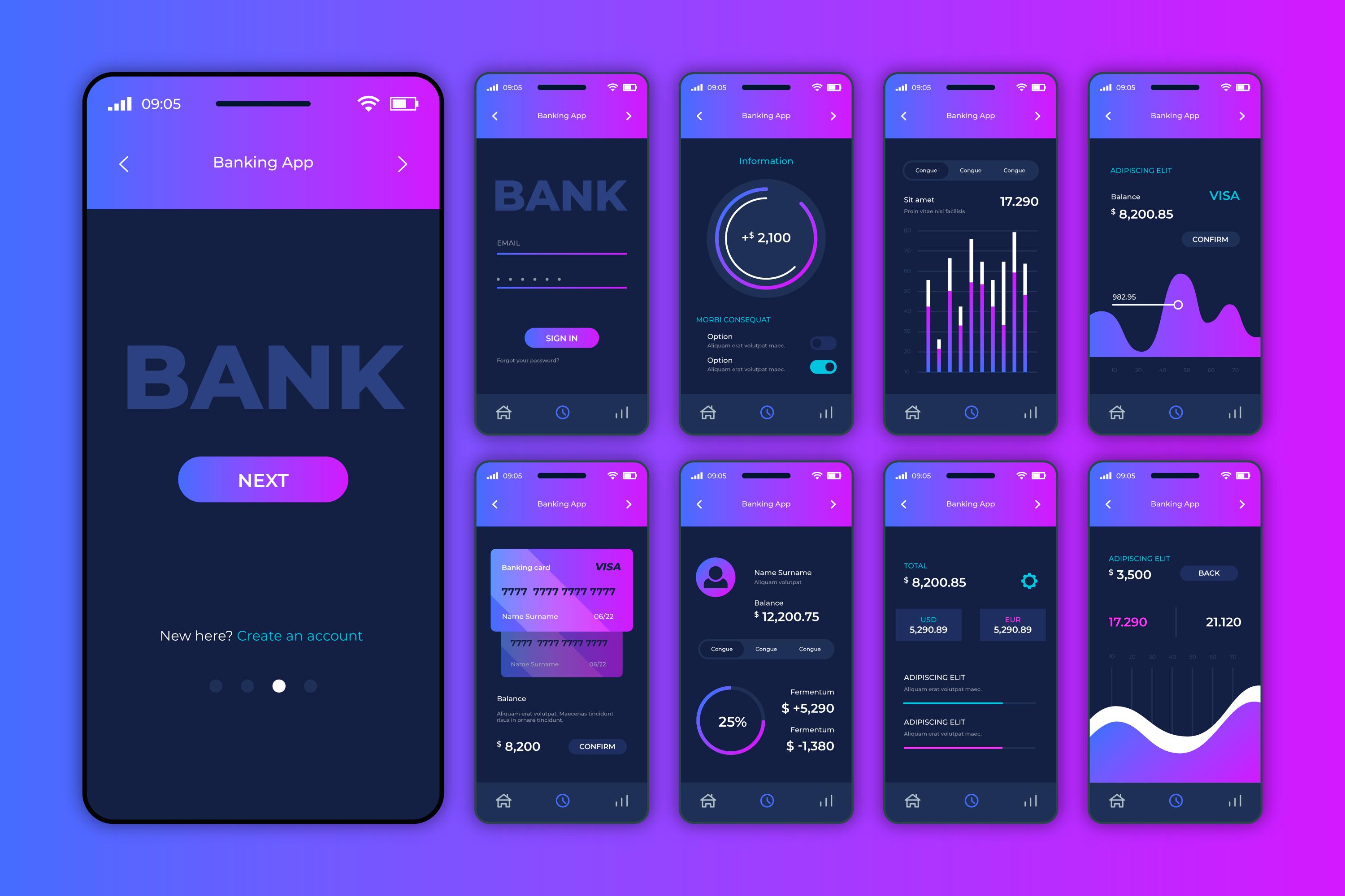
Show the number first. In financial products, the primary data point is almost always a number — a balance, a rate, an amount. Make it the biggest thing on the screen. Everything else is context.
Make the safe action obvious. When there are multiple paths — send money, request money, invest, save — make the most common action the most accessible. Don't bury the primary use case to create visual balance.
Acknowledge the emotional weight. Money is stressful. The best fintech UX acknowledges this — with reassuring confirmation states, clear undo options, and language that's calming rather than clinical. Tone of voice in fintech is underestimated as a design lever.
Fintech UX is hard. The regulatory constraints are real, the technical complexity is real, and the stakes are high. But none of that is an excuse for confusing experiences. The complexity is the reason to invest in simplicity — not a reason to give up on it.